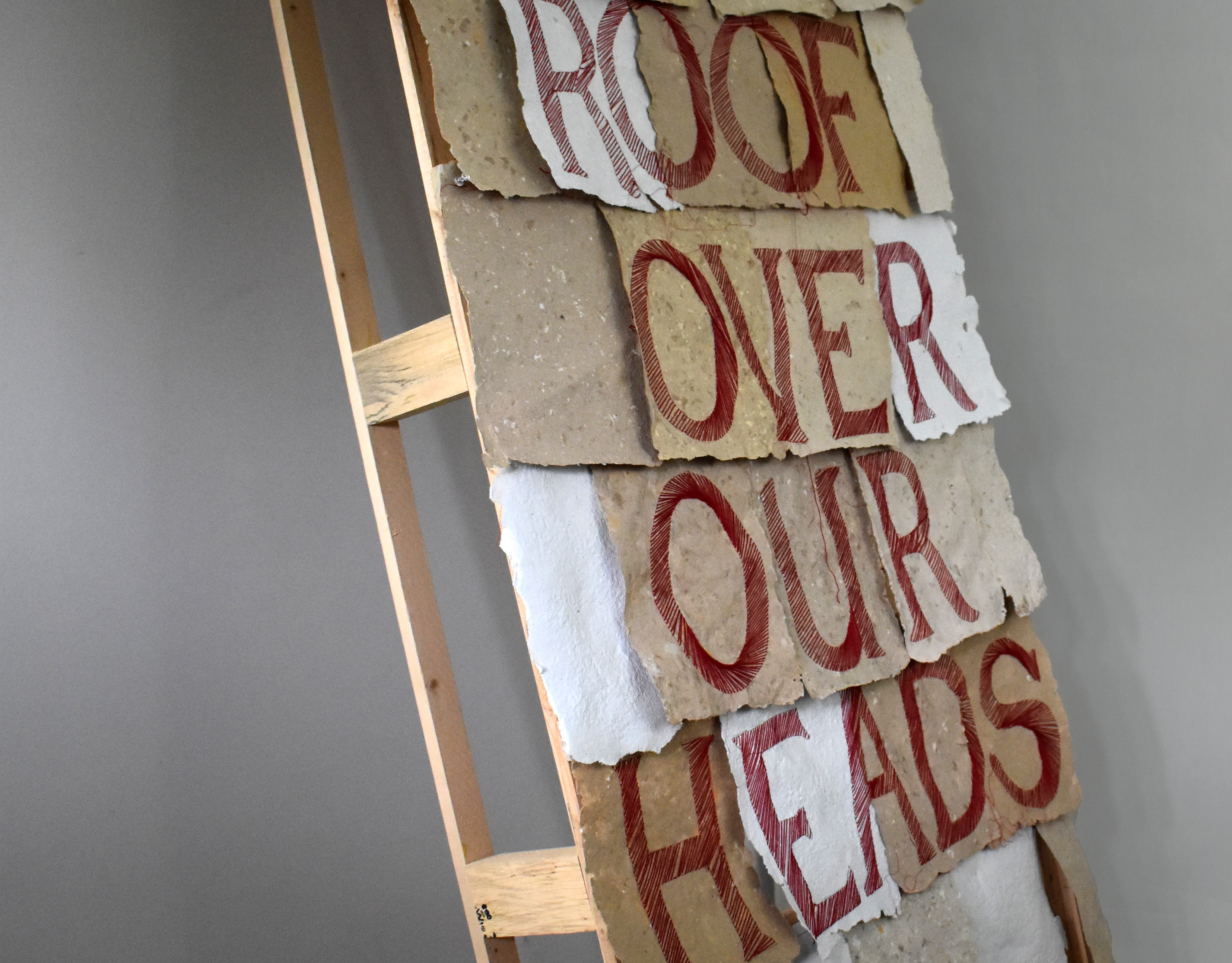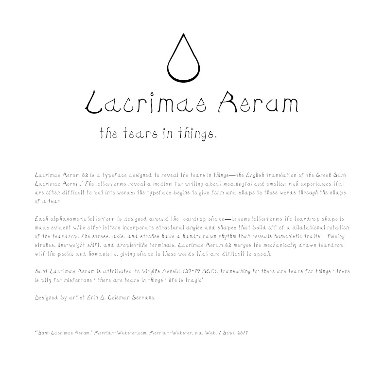
There are tears in things. Type Specimen Page 1. 2018.
Lacrimae Rerum 02 is a typeface designed to reveal the tears in things—the English translation of the Greek Sunt Lacrimae Rerum.* The letterforms reveal a medium for writing about meaningful and emotion-rich experiences that are often difficult to put into words; the typeface begins to give form and shape to those words through the shape of a tear.
Each alphanumeric letterform is designed around the teardrop shape—in some letterforms the teardrop shape is made evident while other letters incorporate structural angles and shapes that build off of a dilatational rotation of the teardrop. The stress, axis, and strokes have a hand-drawn rhythm that reveals humanistic traits—flexing strokes, line-weight shift, and droplet-like terminals. Lacrimae Rerum 02 merges the mechanically drawn teardrop with the poetic and humanistic, giving shape to those words that are difficult to speak.
Sunt Lacrimae Rerum is attributed to Virgil’s Aeneid (29-19 BCE), translating to: there are tears for things : there is pity for misfortune : there are tears in things : life is tragic* Designed by artist Erin D. Coleman Serrano.
*"Sunt Lacrimae Rerum." Merriam-Webster.com. Merriam-Webster, n.d. Web. 1 Sept. 2017
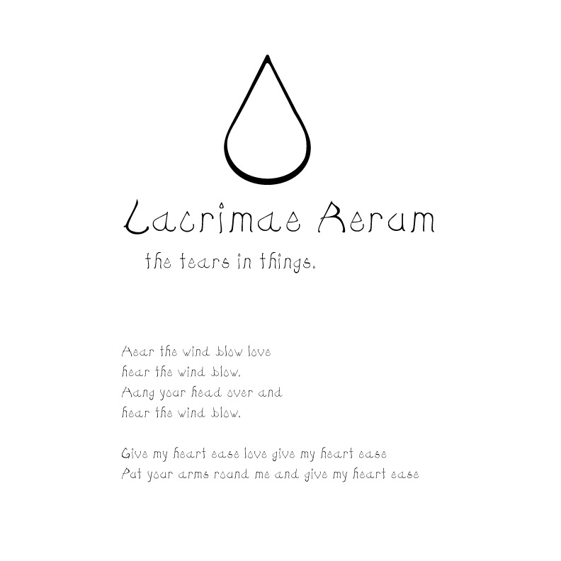
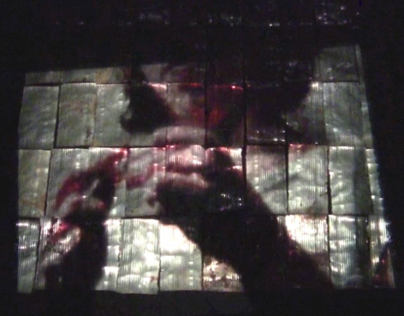
There are tears in things. Lyrics adapted from an old folk song. Page 2. 2018.
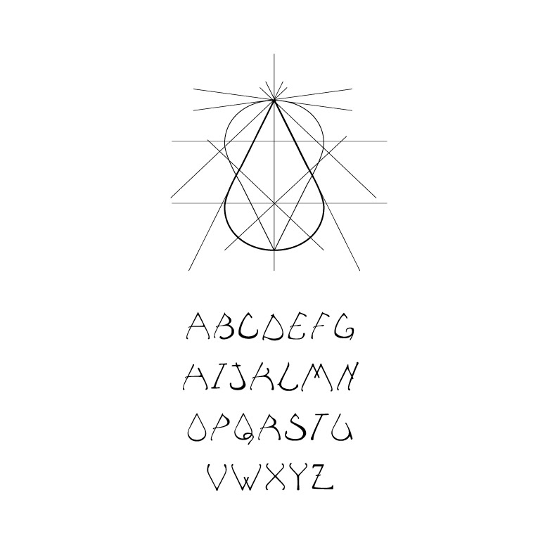
There are tears in things. Digital illustration of upper case letters. Page 3. 2018
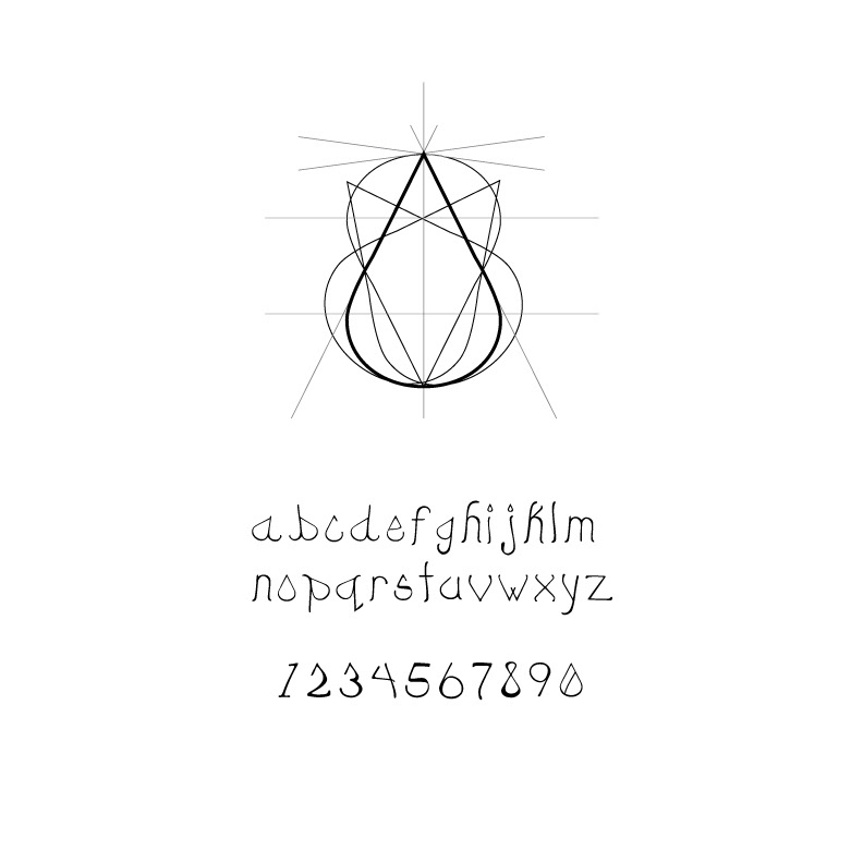
There are tears in things. Digital illustration of lower case letters and numbers. Page 4. 2018