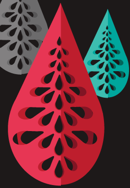
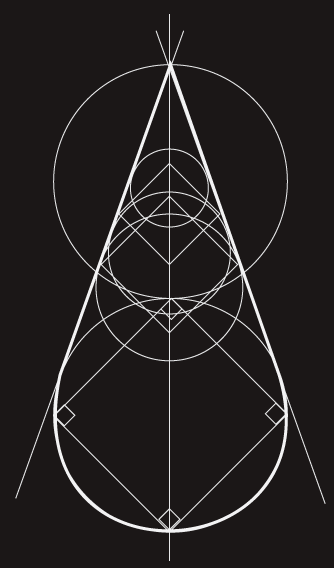
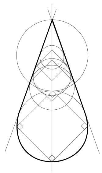
Branding Design for Erin D. Coleman. This personal branding is part of a 2-year transitional plan from 2015-2017. In 2016 I changed my name back to Erin Coleman, dropping the Cruz off of the end of my name after using the name for 12 years. It is challenging to transition the brand name that I have used my entire career into something individual and representative of my current art practice and design brand. The teardrop shape is an iconic design element that connects to the visuals that I use in my work: tears, needlework, and anatomy of a teardrop (with the make-up of salt and water). The "-Cruz" was designed to drop out visually until it disappears from the branding as seen in the sample with the light background.
The next phase will be to reconfigure the mark altogether, taking into consideration that dropping the "-Cruz" shifts the entire visual balance of the graphic and logotype, requiring a new gestalt.